Typographic Soulmates: The Developer’s Guide to Pairing Web Fonts That Scale
Typography is often described as the "clothes" your content wears. While a single font can get the job done, a well-paired duo creates a hierarchy that guides the user’s eye, establishes brand personality, and improves readability. For developers, however, font pairing isn't just about aesthetics—it’s about performance, scalability, and technical implementation.
In this guide, we’ll explore how to find typographic soulmates that not only look great together but also perform seamlessly in a modern web environment.
1. The Rule of Opposites: Contrast vs. Conflict
The most common mistake in font pairing is choosing two fonts that are too similar. If you use two different geometric sans-serifs, the user might sense something is "off" without knowing why. This is conflict.
Instead, aim for contrast. The classic formula is pairing a Serif with a Sans-Serif.
- Serif for Headings / Sans-Serif for Body: This creates a sophisticated, editorial feel. (Example: Playfair Display + Source Sans Pro)
- Sans-Serif for Headings / Serif for Body: This offers a modern, tech-forward look with high readability for long-form text. (Example: Montserrat + Lora)
Why this works for developers
Contrasting styles make it easier to define CSS variables and maintain a clear visual hierarchy. When the styles are distinct, you don't have to rely solely on font size to distinguish a <h1> from a <p>.
2. Technical Harmony: Matching X-Heights
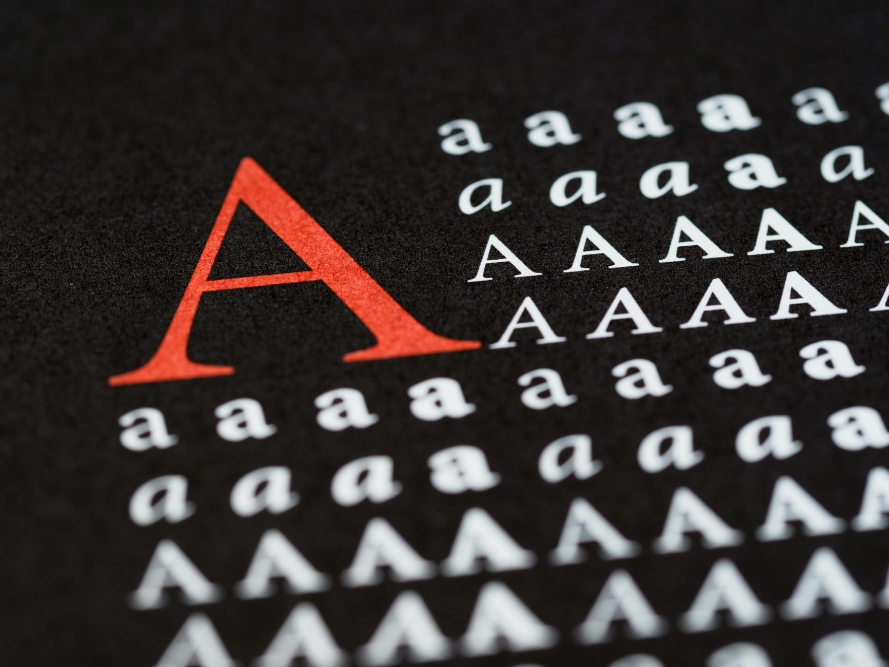
Even if two fonts look different, they need to "sit" together correctly. The most important technical metric here is the x-height—the height of lowercase letters (like 'x') relative to uppercase letters.
If your body font has a very tall x-height and your accent font has a short one, they will look unbalanced when placed side-by-side. When pairing, try to find fonts with similar x-heights to ensure that the visual "weight" of the lines remains consistent as the user’s eye moves across the page.
3. Scaling for the Modern Web
With the rise of fluid design, static font sizes are a thing of the past. To ensure your pairings scale beautifully from a 5-inch smartphone to a 32-inch monitor, leverage modern CSS functions like clamp().
:root {
  /* Fluid Typography: min-size, preferred-size, max-size */
  --font-size-h1: clamp(2rem, 5vw + 1rem, 4.5rem);
  --font-size-body: clamp(1rem, 0.5vw + 0.8rem, 1.25rem);

  --font-heading: 'Fraunces', serif;
  --font-body: 'Inter', sans-serif;
}

h1 {
  font-family: var(--font-heading);
  font-size: var(--font-size-h1);
  line-height: 1.1;
}

p {
  font-family: var(--font-body);
  font-size: var(--font-size-body);
  line-height: 1.6;
}

By using clamp(), you ensure that your typographic pair maintains its relationship regardless of the viewport width, preventing your headings from "breaking" on small screens.
4. Performance: The Variable Font Advantage
The "Soulmate" metaphor gets literal with Variable Fonts. Instead of loading four different files for "Regular," "Bold," "Italic," and "Extra Bold," a single variable font file allows you to interpolate between these weights.
When pairing, try to use at least one variable font. This reduces HTTP requests and gives you granular control over the weight (e.g., setting a font-weight: 540 to perfectly match the visual density of your heading font).
Pro-Tip: font-display
Always use font-display: swap; in your @font-face declarations. This ensures that the browser displays a system fallback font while your "soulmate" fonts are downloading, preventing the dreaded Flash of Invisible Text (FOIT).
5. Three Reliable Pairings to Get You Started
If you’re looking for battle-tested combinations that scale well, try these:
- The Tech Giant: Inter (Sans) + IBM Plex Mono (Monospace). Perfect for dashboards and documentation.
- The Modern Editorial: Fraunces (Variable Serif) + Outfit (Sans). Great for lifestyle blogs or premium SaaS landing pages.
- The Reliable Workhorse: Libre Baskerville (Serif) + Source Sans 3 (Sans). Highly readable for long-form content and educational platforms.
Conclusion
Finding the perfect typographic pair is a balance of art and engineering. By prioritizing contrast, matching x-heights, and utilizing fluid scaling with CSS, you can create a digital experience that is both beautiful and performant.
Remember: the best typography is often the kind the user doesn't notice—it simply makes the reading experience feel natural and effortless.
Photo by Brett Jordan on Pexels