Type in the Dark: Why Your Typography Needs to Shift for Dark Mode UI
Dark mode is no longer a luxury feature; it’s an expectation. From operating systems to mobile apps and SaaS dashboards, users love flipping the switch to ease their eyes in low-light environments.
However, designing a successful dark mode user interface is not as simple as swapping #ffffff for #000000 and calling it a day. If you merely invert your color palette, you’ll quickly notice that your once-beautiful typography suddenly looks blurry, overly bold, and painful to read.
This happens because light behaves differently on dark backgrounds. Here is why your typography needs to shift for dark mode, and how you can fix it.
The Physics of Light: Understanding Halation
Why does light text on a dark background look different? The culprit is an optical phenomenon called halation.
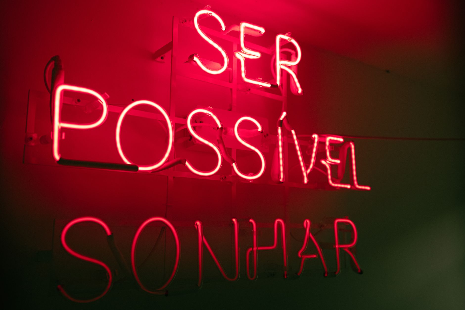
When bright text is set against a dark background, the light emitted from the letters bleeds into the surrounding dark pixels. To the human eye, this makes the glyphs appear thicker and more glowing than they actually are.
Conversely, dark text on a light background is compressed by the surrounding light, making it look slightly thinner. If you use the exact same font weight for both light and dark modes, your dark mode text will look bloated, losing its crisp definition and closing up counter spaces (the negative spaces inside letters like "o", "e", and "a").
4 Essential Typography Shifts for Dark Mode
To combat halation and keep your user interface highly readable, you need to make specific, deliberate typographic adjustments when switching from light to dark.
1. Step Down the Font Weight
Since halation artificially bolds your text, you must compensate by reducing the actual font weight. If your light-mode body text uses a weight of 400 (Regular), you will likely want to drop it to 300 (Light) or use a slightly lighter custom weight for dark mode. Variable fonts make this incredibly easy, as you can dial in the exact weight dynamically.
2. Open Up the Letter-Spacing (Tracking)
Because letters bleed outward in dark mode, they can easily run into one another. To maintain legibility, slightly increase your letter-spacing. Adding just 0.01em to 0.03em of letter spacing to body copy and small UI text can dramatically improve readability by giving the letters breathing room.
3. Avoid Pure White on Pure Black
Pure white text (#FFFFFF) on a pure black background (#000000) creates a harsh, high-contrast vibrating effect that causes quick eye strain. Instead, use an off-white or soft light gray (like #E2E8F0 or #F4F4F5) against a dark slate or deep gray background. This reduces the intensity of the light emission, lessening the halation effect.
4. Expand Your Line-Height (Leading)
White-on-dark text requires more negative space to remain scannable. Increasing your line-height slightly (for example, moving from 1.5 to 1.55 or 1.6) helps the eye navigate the text lines without getting lost in the darkness.
Implementing the Shift in CSS

By leveraging CSS custom properties (variables) and the prefers-color-scheme media query, you can implement these typographic refinements cleanly and programmatically.
:root {
  --body-bg: #ffffff;
  --text-color: #1a1a1a;
  --font-weight-body: 400;
  --letter-spacing-body: normal;
  --line-height-body: 1.5;
}

@media (prefers-color-scheme: dark) {
  :root {
    --body-bg: #121212;
    --text-color: #e4e4e7; /* Soft off-white to reduce glare */
    --font-weight-body: 350; /* Compensating for halation with variable font */
    --letter-spacing-body: 0.02em; /* Extra breathing room */
    --line-height-body: 1.58; /* Increased line-height */
  }
}

body {
  background-color: var(--body-bg);
  color: var(--text-color);
  font-weight: var(--font-weight-body);
  letter-spacing: var(--letter-spacing-body);
  line-height: var(--line-height-body);
  transition: background-color 0.3s, color 0.3s;
}
Conclusion
Designing for dark mode is an exercise in optical physics and human perception. By recognizing that light text behaves differently on a dark canvas, you can move beyond simple color inversion. Making subtle adjustments to weight, tracking, and contrast ensures your interface remains as legible, comfortable, and beautiful at midnight as it is at midday.
Photo by João Godoy on Pexels