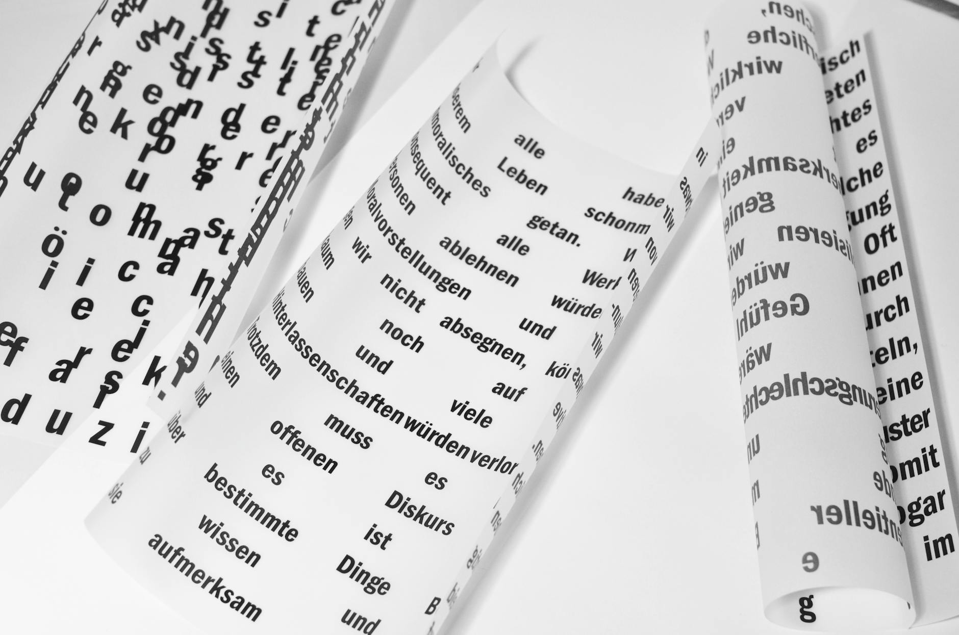
The 'One Font' Rule: Why Variable Typefaces are Redefining Web Typography
For years, web designers and developers have been locked in a silent tug-of-war. Designers want rich, expressive typography featuring diverse weights, italics, and condensed widths to build beautiful visual hierarchies. On the other side, developers guard performance fiercely, knowing that every additional font file adds weight to the page load, driving up bounce rates and hurting SEO.
To keep websites fast, we historically adhered to strict budgets: "No more than three font weights."
But the landscape has shifted. Thanks to the evolution of OpenType Variable Fonts, we no longer have to compromise. The "One Font" Rule is redefining web typography, allowing us to load a single file while unlocking an infinite spectrum of design possibilities.
The Problem with Static Fonts
To understand the magic of variable fonts, we must look at how traditional (static) web fonts work.
If you wanted to use a font family like Inter or Roboto on your site, you had to load a separate file (usually a .woff2 file) for every single variation. For example:
- Inter Regular (400) ~ 20KB
- Inter Italic (400 Italic) ~ 20KB
- Inter Semi-Bold (600) ~ 20KB
- Inter Bold (700) ~ 20KB
Before you know it, you are loading 80KB to 100KB of data just for basic text formatting. If you want a condensed version for headings or ultra-light weights for hero sections, that number can easily double. This leads to FOIT (Flash of Invisible Text) or FOUT (Flash of Unstyled Text) as browsers struggle to download and render these files.
What is a Variable Font?
A variable font is a single font file that behaves like multiple fonts. Instead of containing rigid, pre-defined outlines for individual weights or styles, a variable font contains "axes of variation."
These axes define a range of possibilities, allowing the browser to dynamically interpolate and render any variation along those axes on the fly.
The Five Standard Axes
While type designers can create custom axes, the OpenType specification defines five standard, registered axes:
- Weight (
wght): Controls how bold or light the font is (typically ranging from 1 to 1000). - Width (
wdth): Controls how narrow or wide the characters are. - Slant (
slnt): Rotates the characters dynamically for oblique styles. - Italic (
ital): Toggles or transitions to specific italic letterforms. - Optical Size (
opsz): Adjusts character spacing, contrast, and stroke thickness automatically depending on the display size (optimizing readability for small body text vs. large display headers).
Implementing the "One Font" Rule in CSS
Implementing a variable font is incredibly straightforward. It uses the familiar @font-face rule but introduces a few key syntactical differences to declare the ranges available.
Here is how you define a variable font in your CSS stylesheet:
@font-face {
  font-family: 'Inter Variable';
  src: url('/fonts/Inter-VariableFont_slnt,wght.woff2') format('woff2-variations');
  font-weight: 100 900; /* Defines the available range of weights */
  font-style: oblique 0deg 10deg; /* Defines the available range of slant */
}
Once defined, you are no longer limited to standard increments like 400 or 700. You can fine-tune your typography using precise, fluid values:
h1 {
  font-family: 'Inter Variable', sans-serif;
  font-weight: 850; /* A custom, ultra-bold weight */
  font-stretch: 105%; /* Sightly wider for headers */
}

p {
  font-family: 'Inter Variable', sans-serif;
  font-weight: 425; /* Slightly heavier than regular for better readability on dark backgrounds */
}

For custom axes or deeper control, you can use the font-variation-settings property, which acts as a low-level control panel:
.dynamic-header {
  /* Utilizing Weight (wght) and Slant (slnt) axes */
  font-variation-settings: 'wght' 650, 'slnt' -8;
}
Why the "One Font" Rule Changes Everything
The shift from static to variable typography is more than just a performance upgrade; it is a fundamental shift in how we approach responsive web design.
1. Unmatched Performance
Instead of loading four to six separate font files, you load one. While a variable font file might be slightly larger than a single static file (e.g., 60KB vs. 20KB), it is significantly smaller than the cumulative size of several static weights combined. You get twenty times the creative flexibility at a fraction of the performance cost.
2. Fluid Responsive Typography
Traditionally, we changed font size across media queries. With variable fonts, we can dynamically adjust the font's weight and width depending on screen size. On mobile screens, you can make your headings slightly narrower (wdth) and lighter (wght) to prevent awkward line breaks and improve readability in tight spaces.
3. Transition and Animation Capabilities
Because variable font axes are numerical, they can be fully transitioned and animated using CSS transitions or keyframes. You can create subtle hover effects where a link grows bolder, or build interactive headers that react to a user’s scroll position.
.interactive-link {
  font-family: 'Inter Variable', sans-serif;
  font-weight: 400;
  transition: font-weight 0.3s ease;
}

.interactive-link:hover {
  font-weight: 600; /* Smoothly transitions from regular to semi-bold */
}
The Verdict
The "One Font" Rule simplifies our asset pipelines, boosts our Core Web Vitals, and unlocks unprecedented creative freedom. By downloading just one highly-optimized variable font file, we can deliver beautiful, responsive, and incredibly fast experiences to our users.
If you haven't transitioned your projects to variable typography yet, there has never been a better time to start.
Photo by Skylar Kang on Pexels