The Invisible UX: How Micro-Typography and Optical Sizes Quietly Double Conversion Rates
When digital product teams talk about conversion rate optimization (CRO), they usually discuss redesigned checkout flows, bolder primary CTA buttons, or punchier hero copy. Yet, one of the most effective levers for lowering friction and boosting sales remains hidden in plain sight: micro-typography.
Micro-typography isn't about choosing between popular font families. It is the obsessive calibration of optical sizes, dynamic letter spacing, line heights, and tabular alignments. When executed correctly, micro-typography becomes completely invisible—removing subconscious cognitive strain and letting users absorb value effortlessly.
What Are Optical Sizes (and Why Should You Care)?
Historically, lead typefounders created distinct metal casts for every point size. A 6pt font was cut with thicker strokes, wider proportions, and looser spacing so it remained legible at tiny scales. Conversely, a 72pt display font had delicate serifs, tight spacing, and high contrast between thick and thin strokes.
When digital fonts emerged, this craftsmanship was largely lost; a single vector outline was scaled up or down mechanically.
Today, modern web typography and variable fonts bring optical sizing back to life via the opsz CSS property.
How Optical Sizes Work Under the Hood
At smaller pixel dimensions (e.g., 11px to 14px caption or form helper text), optical sizing automatically adjusts letterforms:
- Thicker thin strokes to prevent glyphs from disappearing on low-DPI displays.
- Wider counter-shapes (e.g., the inside loop of an 'e' or 'a') to avoid visual clogging.
- Increased tracking (letter-spacing) so individual characters remain distinct.
At larger display sizes (e.g., 48px hero headlines), optical sizing does the inverse: sharpening stroke contrast and tightening character spacing for an authoritative, elegant feel.
The Cognitive Load Connection: Why Micro-Details Drive Conversions
Reading on a screen is inherently taxing. The human eye scans text in rapid jumping movements called saccades. When typography lacks optical refinement, saccades become erratic, and reading velocity slows down significantly.
This introduces micro-friction.
While a user will never explicitly think, "This font's x-height is 2% too compressed for this size," their brain registers the visual fatigue. This fatigue translates directly into drop-offs across your marketing funnel:
- Long-Form Sales Pages: Lower scroll depth due to eye strain.
- Pricing Grids: Difficulty scanning dense technical specs or features.
- Checkout Forms: Increased error rates when interpreting fine-print labels and field validation text.
By lowering cognitive strain through optical sizing and precise line-heights, you preserve the user's attention span—directly improving completion rates.
Implementing Micro-Typography in Modern CSS
Modern browsers support optical sizing natively when using variable fonts that include the opsz axis (such as Inter, SF Pro, or Roboto Flex).
Here is how you can enable and fine-tune optical sizes in your stylesheet:
/* Enable automatic optical sizing globally */
html {
  font-family: 'Inter', system-ui, sans-serif;
  font-optical-sizing: auto;
  -webkit-font-smoothing: antialiased;
}

/* Hero Title: High optical size, tight tracking */
.hero-headline {
  font-size: 3.5rem;
  font-variation-settings: 'opsz' 56;
  letter-spacing: -0.025em;
  line-height: 1.1;
}

/* Micro-Text: Low optical size, relaxed tracking */
.form-caption-text {
  font-size: 0.75rem; /* 12px */
  font-variation-settings: 'opsz' 12;
  letter-spacing: 0.03em;
  line-height: 1.4;
}

3 Key Micro-Typographic Rules for High-Converting Layouts
- Scale Tracking Inversely: As
font-sizedecreases,letter-spacingmust increase. Micro-labels require positive tracking (0.02emto0.04em), while display headlines require negative tracking (-0.01emto-0.03em). - Calibrate Line-Height Dynamically: Body text around 16px thrives at a
1.5to1.6line-height multiplier. Display titles above 36px look detached at that scale and should be tightened to1.1–1.2. - Use Tabular Numerals for Data & Pricing: Standard proportional numbers have varying widths (a "1" is narrower than an "8"), causing financial figures to jitter. Use tabular monospaced numbers to align digits vertically for effortless scanning:
.pricing-table .price-amount {
  font-variant-numeric: tabular-nums;
}
Summary Checklist: Elevate Your Typography Today
- Adopt Variable Fonts: Transition to modern font families that offer built-in
opszaxes. - Set
font-optical-sizing: auto: Add this single declaration to your base stylesheet layer. - Refine Small Labels: Add positive letter-spacing to micro-copy, badges, and input helper text.
- Align Numeric Data: Enable
tabular-numsacross checkout tables and financial dashboards.
Micro-typography isn't just a design luxury—it's a subtle engineering discipline. By taking care of the smallest visual details, you eliminate reading resistance and create a seamless path to conversion.
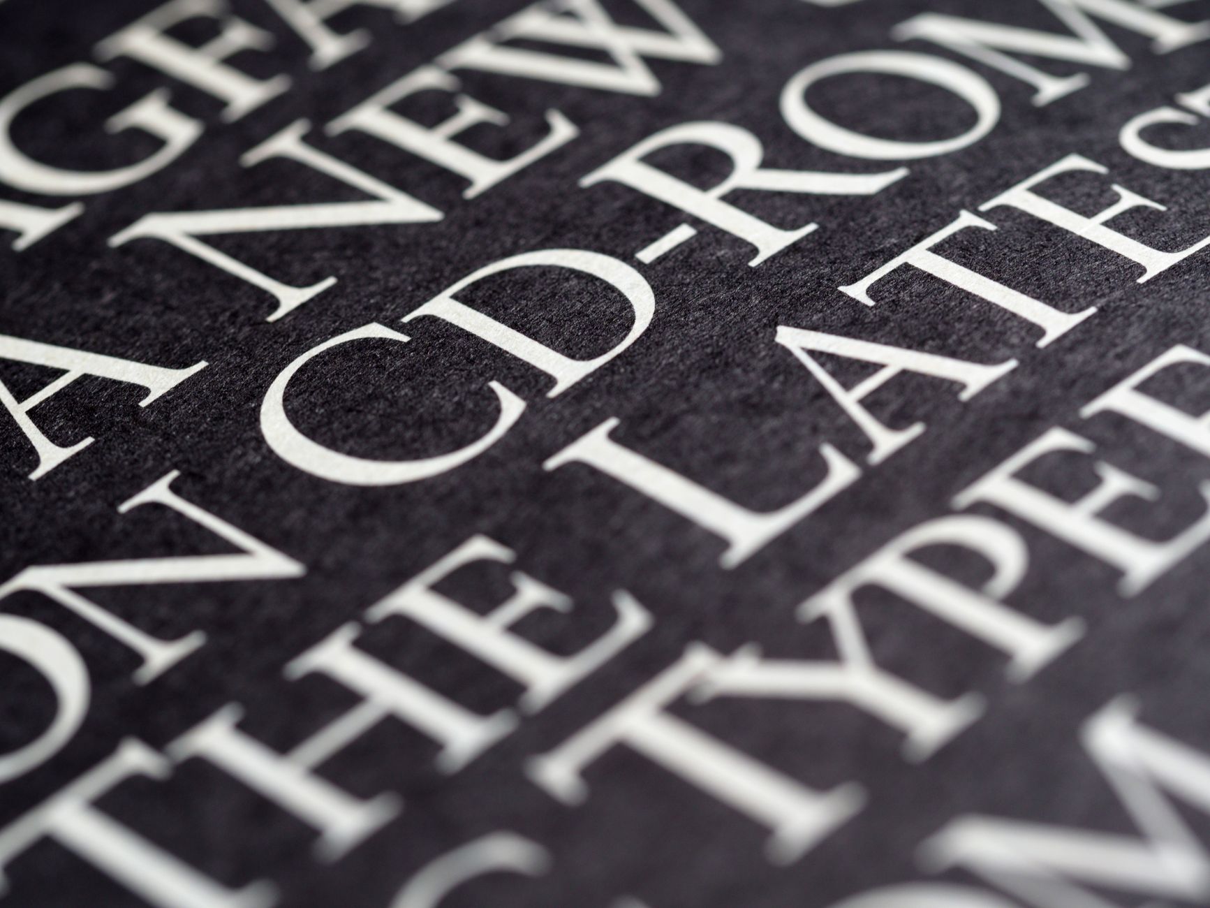
Photo by Brett Jordan on Pexels