The Dark Mode Typographic Trap: Why Your Fonts Look Bolder in the Dark (and How to Fix It)
When dark mode swept through the digital design landscape, it was hailed as a savior for battery life and late-night eye strain. Designers quickly began swapping light backgrounds for deep charcoals and pitch blacks, swapping dark text for crisp whites.
But if you’ve ever implemented a dark mode toggle and felt like your typography suddenly looked clumsy, bloated, or slightly blurry—you aren't imagining things. You've fallen into the dark mode typographic trap.
Here is the science behind why fonts look bolder on dark backgrounds, and how you can use modern CSS and design principles to fix it.
The Science of the "Irradiation Illusion"
To understand why fonts change visual weight in dark mode, we have to look at how the human eye processes light.
This phenomenon is known as the Irradiation Illusion, first documented by Galileo Galilei. When our eyes look at a bright object on a dark background, the light "bleeds" over the edges of the image on our retina. On a screen, glowing white pixels surrounded by dark, turned-off pixels physically seem larger to our eyes than dark pixels surrounded by light ones.
The result? The exact same font at the exact same CSS font-weight will look roughly 10% to 15% bolder when flipped from light-on-dark to dark-on-light. What looked like an elegant, clean sans-serif in light mode suddenly looks thick, clumsy, and harder to read in dark mode.
How to Fix It: A Typographic Blueprint
To maintain visual hierarchy and readability across both themes, your typography needs to adapt. Here are the four best ways to combat the irradiation illusion.
1. Leverage Variable Fonts to Tweak Weight
The rise of variable fonts is a game-changer for responsive typography. Instead of choosing between static jumps (like 400 to 300), variable fonts allow you to adjust the weight by precise, single increments.
When dark mode is active, slightly reduce the font-weight of your body text:
:root {
  --bg-color: #ffffff;
  --text-color: #1a1a1a;
  --font-weight-body: 400;
  --font-weight-bold: 700;
}

@media (prefers-color-scheme: dark) {
  :root {
    --bg-color: #121212;
    --text-color: #f4f4f5;
    /* Soften the weights to combat irradiation */
    --font-weight-body: 360;
    --font-weight-bold: 660;
  }
}

body {
  background-color: var(--bg-color);
  color: var(--text-color);
  font-weight: var(--font-weight-body);
}

strong {
  font-weight: var(--font-weight-bold);
}

2. Avoid Pure White on Pure Black
High-contrast displays magnify the irradiation illusion. If you use pure white (#FFFFFF) on pure black (#000000), the glow of the text becomes harsh and uncomfortable to read over long periods.
To fix this, soften the contrast:
- Use a dark gray background instead of pure black (e.g.,
#121212or#18181b). - Use an off-white or light-gray text color instead of pure white (e.g.,
#e4e4e7or#d4d4d8).
This reduces the intensity of the light bleeding into the dark pixels, immediately making your fonts look thinner and sharper.
3. Slightly Increase Letter-Spacing
Because the letters "bloom" and expand in the dark, the space between them (tracking) effectively shrinks. Characters like e, a, and o can lose their counters (the negative space inside the letters), making them blend together.
To counteract this, add a tiny amount of letter-spacing in dark mode:
@media (prefers-color-scheme: dark) {
  body {
    letter-spacing: 0.01em;
  }
}
This tiny adjustment lets the letters "breathe" and preserves the rhythm of the text block.
4. Adjust Font Smoothing for WebKit Engines
On macOS and iOS devices, subpixel antialiasing can make text on dark backgrounds look excessively heavy. You can use non-standard CSS properties to change how the browser renders the font, choosing grayscale antialiasing instead:
@media (prefers-color-scheme: dark) {
  body {
    -webkit-font-smoothing: antialiased;
    -moz-osx-font-smoothing: grayscale;
  }
}
Note: Use this property sparingly and test across browsers, as it changes rendering behavior across different operating systems.
Small Adjustments, Big Impact
True accessibility and design polish lie in these microscopic details. By adjusting your font weight, softening your contrast, and giving your letters a fraction more space to breathe, you ensure that your website's reading experience is just as premium in the dark as it is in the light.
Test your UI tonight with the lights off—your users’ eyes will thank you.
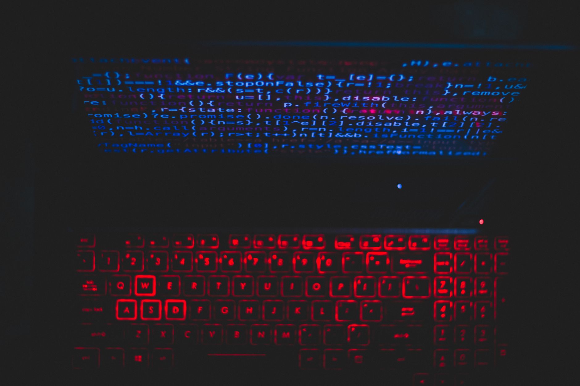
Photo by Rahul Pandit on Pexels