The Dark Mode Typographic Trap: Why Light-Mode Fonts Look Heavy in the Dark (And How to Fix It)
When dark mode gained widespread adoption across modern operating systems and web applications, many designers and developers assumed switching color schemes was as simple as inverting palette values: swap white backgrounds for dark gray, and make dark text white.
However, if you've ever flipped the switch on a carefully crafted light-mode UI, you may have noticed something unsettling. The text suddenly looks chunkier, slightly blurred around the edges, and distinctly heavier—as though someone applied an extra font-weight: 600 across your entire page.
This isn't an optical illusion caused by eye fatigue; it’s a well-documented visual phenomenon. Here is why light-mode typography breaks in the dark, and how you can fix it using modern CSS techniques.
The Science: Why Dark Mode Text Looks So Heavy
The primary culprit behind "bloated" dark mode typography is an optical phenomenon known as irradiation, often referred to in screen design as halation.
When dark text sits on a bright background, the surrounding light contracts around the dark glyphs, making the letterforms appear slightly thinner and sharper to the human eye. But when you place bright, luminous text against a dark background, the light emitted by the letters bleeds outward into the surrounding dark space.
Light Mode (Dark on Light):   Bright background contracts surrounding dark text -> Thinner optical weight
Dark Mode (Light on Dark):    Bright text bleeds into dark background           -> Thicker optical weight
Because your screen pixels are actively glowing, light-colored letterforms expand visually. A font-weight: 400 font that looks crisp on a white canvas suddenly appears around 450 or 500 on a dark slate canvas.
Fix #1: Reduce Font Weight in Dark Mode
The most direct solution is to reduce the weight of your body text when dark mode is active.
If you are using static web fonts (where you only have set weights like 400, 500, 700), you might need to drop from a Regular (400) or Medium (500) weight to a Light (300) weight for dark mode body text. However, static font jumps can sometimes feel too extreme.
The Power of Variable Fonts
Variable fonts offer a fine-grained solution to this problem. Instead of jumping 100-unit increments in weight, variable fonts allow you to dial in exact numeric weights like 360 or 375.
:root {
  --body-weight: 400;
  --text-color: #1a1a1a;
  --bg-color: #ffffff;
}

@media (prefers-color-scheme: dark) {
  :root {
    --body-weight: 350; /* Optically compensates for halation */
    --text-color: #e4e4e7;
    --bg-color: #121212;
  }
}

body {
  background-color: var(--bg-color);
  color: var(--text-color);
  font-weight: var(--body-weight);
}
Leveraging the Grade (GRAD) Axis
Some advanced variable fonts include a dedicated Grade (GRAD) axis. Unlike the standard Weight (wght) axis, changing a font's Grade modifies the thickness of the letterforms without changing their horizontal spacing or line layout.
This means you can adjust font thickness for dark mode without triggering layout shifts or recalculating line wraps!

@media (prefers-color-scheme: dark) {
  body {
    /* Lowers text thickness without changing element width */
    font-variation-settings: "GRAD" -25;
  }
}
Fix #2: Increase Letter Spacing Slightly
Because glowing text bleeds outward, characters in dark mode tend to crowd each other. Counter-spaces (the empty areas inside letters like o, e, and a) close up, hurting legibility.
Adding a tiny amount of positive letter spacing compensates for this light expansion and restores breathing room between characters:
@media (prefers-color-scheme: dark) {
  body {
    /* A subtle boost in tracking restores character separation */
    letter-spacing: 0.015em;
  }
}
Fix #3: Soften High Contrast
Pure white (#FFFFFF) on pure black (#000000) maximizes light bleed and creates harsh visual vibration, aggravating eye strain. Softening contrast is one of the easiest ways to tame heavy text.
Instead of absolute white, use off-white or translucent white for body copy in dark mode:
:root {
  /* Avoid #FFFFFF on dark backgrounds */
  --text-primary-dark: rgba(255, 255, 255, 0.87);
  --text-secondary-dark: rgba(255, 255, 255, 0.60);
}
By lowering the contrast slightly, you reduce pixel luminance, which directly decreases the halation effect that causes text to look bloated.
Summary Checklist for Dark Mode Typography
To keep your typography crisp, elegant, and readable across all lighting conditions, keep this simple checklist in mind:
- Reduce font weight: Drop body copy weight by 30–50 units using variable fonts.
- Use Grade (
GRAD) if available: Adjust font thickness without breaking layout dimensions. - Add tracking: Add
0.01emto0.02emletter-spacingto prevent characters from bleeding together. - Avoid
#FFFFFFon#000000: Use muted off-whites (e.g.,rgba(255, 255, 255, 0.87)) to reduce light emission.
By making these optical adjustments, your dark themes will look balanced, professional, and visually consistent with your light mode designs.
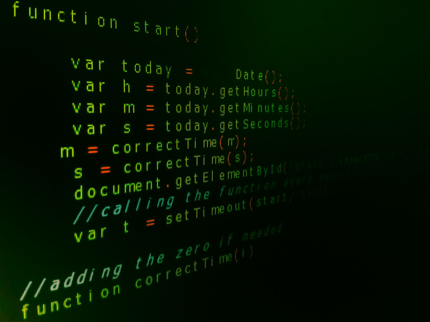
Photo by Jorge Jesus on Pexels