The Dark Mode Optical Illusion: How to Adjust Typography for Dark UI
When dark mode first took the digital world by storm, many designers believed that implementing it was as simple as running a mathematical inversion: turn your background black, turn your text white, and call it a day.
However, if you have ever tried this, you probably noticed that something felt... off. The text suddenly looked bulkier, almost as if it had been given a bold styling. The letterforms bled into one another, making the interface feel cramped and tiring to read.
This isn’t a bug in your rendering engine; it’s a biological quirk of the human eye known as the irradiation illusion. Here is how this optical illusion affects your dark UI, and how you can master your CSS to correct it.
The Science: Why Dark Mode Text Looks Bolder
The irradiation illusion (often referred to in typography as halation) is a phenomenon where light areas of an image appear to bleed into adjacent dark areas.
In our eyes, light-sensitive photoreceptors become overstimulated when looking at bright elements against a dark background. This overstimulation causes the light elements to physically "spread" across our retinas.
- Light Mode (Dark on Light): The background glows, slightly "squeezing" the dark letterforms, making them appear thinner.
- Dark Mode (Light on Dark): The text glows, bleeding outward into the dark background, making the letters appear significantly thicker and fuzzier.
Because of this, if you use the exact same font weight for both light and dark modes, your dark mode text will always look bolder and harder to read. To achieve visual parity, you must actively design against this illusion.
How to Adjust Typography for Dark UI
To maintain readability and elegance in dark mode, you need to make three critical typographical adjustments: weight, spacing, and contrast.
1. Lighten the Font Weight
To counteract the glowing effect, you should slightly decrease your font weight when switching to a dark interface. If you are using a standard font weight of 500 (Medium) in light mode, you may want to drop it down to 400 (Regular) in dark mode.
This is where variable fonts truly shine. Instead of jumping between rigid blocks of weight (like 400 to 500), variable fonts allow you to shave off just enough weight to balance the optical illusion.
/* Light Mode */
.body-text {
  font-family: 'Inter Var', sans-serif;
  font-weight: 450;
  color: #1a1a1a;
}

/* Dark Mode adjustment */
@media (prefers-color-scheme: dark) {
  .body-text {
    font-weight: 400; /* Slightly thinner to combat halation */
    color: #e2e8f0;
  }
}
2. Open Up the Letter-Spacing (Tracking)
Because light characters bleed outward, the empty spaces inside letters (counters) and the gaps between letters shrink. Letters like e, a, and o can easily become muddy, while letter combinations like rn can merge into an m.
To compensate, increase your letter-spacing (tracking) slightly in dark mode. A tiny adjustment—often as little as 0.01em to 0.02em—makes a massive difference in legibility.
.body-text {
  letter-spacing: -0.01em; /* Tight tracking works well in light mode */
}

@media (prefers-color-scheme: dark) {
  .body-text {
    letter-spacing: 0.01em; /* Loosened up to keep letters distinct */
  }
}

3. Avoid Pure White on Pure Black
The intensity of the irradiation illusion is directly proportional to contrast. Putting pure white text (#FFFFFF) on a pitch-black background (#000000) creates maximum contrast, which severely worsens eye strain and halation.
To fix this:
- Soften the text: Use an off-white or light gray (like
#E2E8F0or#F1F5F9). - Soften the background: Use a deep, dark gray or dark blue instead of solid black (like
#0F172Aor#121212).
This reduces the intensity of the light emitting from the letters, instantly making the text look sharper and more comfortable to read over long periods.
Putting It All Together
Here is a practical, production-ready CSS custom property system that handles these optical adjustments seamlessly:
:root {
  --bg-color: #ffffff;
  --text-color: #1e293b;
  --font-weight-body: 450;
  --letter-spacing-body: -0.01em;
}

@media (prefers-color-scheme: dark) {
  :root {
    --bg-color: #0f172a;          /* Deep navy gray instead of black */
    --text-color: #f1f5f9;        /* Soft white instead of pure white */
    --font-weight-body: 380;      /* Slightly reduced weight */
    --letter-spacing-body: 0.015em; /* Expanded tracking */
  }
}

body {
  background-color: var(--bg-color);
  color: var(--text-color);
  font-family: 'Inter Var', sans-serif;
  font-weight: var(--font-weight-body);
  letter-spacing: var(--letter-spacing-body);
  transition: background-color 0.3s, color 0.3s;
}
Conclusion
Great typography is invisible. When text is adjusted properly, the reader doesn't notice the subtle shift in weight or tracking; they simply experience a seamless, comfortable reading experience. By compensating for the biological limits of our eyes, you can ensure your dark mode UIs are just as beautiful, accessible, and readable as their light mode counterparts.
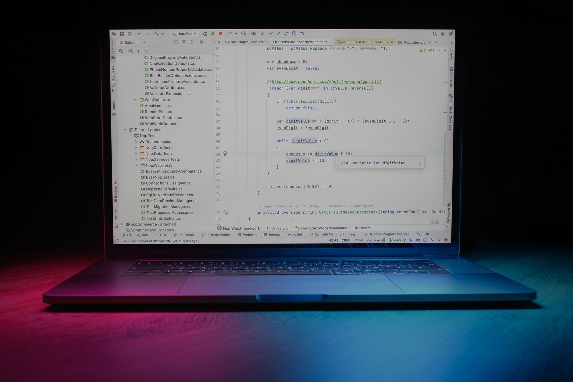
Photo by Daniil Komov on Pexels