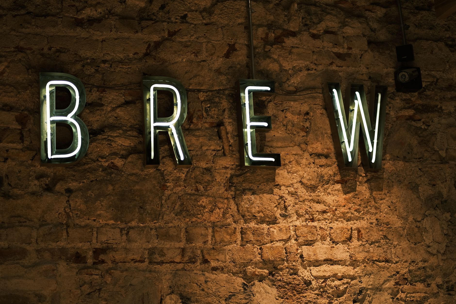
The Dark Mode Font Paradox: Why Great Typefaces Go Bad in the Dark (And How to Fix Them)
You have designed the perfect light-mode interface. The typography is balanced, the visual hierarchy is clear, and the body text feels effortless to read. Then, you toggle dark mode—and suddenly everything looks off.
The crisp 16px body copy that felt perfectly proportioned in light mode now appears heavy, bloated, and uncomfortably harsh against the dark canvas. Headlines feel overly aggressive, and tight letter-spacing creates weird visual vibration.
Welcome to The Dark Mode Font Paradox: a physiological and visual phenomenon where light text on dark backgrounds fundamentally alters how our eyes perceive letterforms.
The Science Behind the Paradox: The Irradiation Illusion
Why does typography change personality in the dark? The culprit isn't your visual taste—it's human biology.
The primary driver is an optical effect called the Irradiation Illusion (or halation). When bright light shines out from a dark background—such as white pixels glowing on an OLED screen—the light bleeds into the surrounding dark areas.
To the human eye:
- Light text on dark backgrounds appears 5% to 10% thicker than dark text on light backgrounds.
- Pure white text on pure black causes severe contrast strain, causing letter edges to glow, blur, and bleed together.
Because light pixels literally expand into adjacent dark pixels in our visual cortex, a Regular weight font (400) suddenly looks like a Medium weight (500).
The Three Mistakes Destroying Your Dark Mode Type
Before looking at solutions, let's identify the most common mistakes designers and developers make when implementing dark mode typography.
1. Using Pure #FFFFFF on Pure #000000
Maximum contrast (#FFFFFF on #000000) creates extreme halation. The extreme luminant contrast causes eye fatigue, visual vibration, and severe light bleed.
2. Keeping the Same Font Weights Across Modes
If you use font-weight: 400 in light mode and keep font-weight: 400 in dark mode, your dark mode text will naturally feel visually heavier.
3. Ignoring Tracking (Letter Spacing)
Because characters visually expand in dark mode, light text needs slightly more breathing room. Keeping light-mode letter-spacing in dark mode causes letters to feel cramped and touch at tighter kerning pairs.
4 CSS Strategies to Fix Dark Mode Typography
Fortunately, modern CSS and variable fonts give us precise control to counteract these optical illusions.
1. Soften the Contrast Ratio
Never use pure white text on pure black backgrounds for long-form reading. Instead, reduce the contrast to a comfortable range (aim for roughly 12:1 to 15:1 contrast ratio instead of 21:1).
/* Light Mode Defaults */
:root {
  --bg-color: #ffffff;
  --text-primary: #111827; /* Dark charcoal */
}

/* Dark Mode Overrides */
@media (prefers-color-scheme: dark) {
  :root {
    --bg-color: #0f172a;     /* Deep slate blue/black */
    --text-primary: #e2e8f0; /* Off-white / cool grey */
  }
}
2. Reduce Font Weight Slightly
If your font family offers fine-grained static weights or variable font capabilities, reduce the font-weight in dark mode by roughly 30–50 units.
body {
  font-weight: 400;
}

@media (prefers-color-scheme: dark) {
  body {
    /* Step down from 400 to 350 or 370 using a variable font */
    font-weight: 370;
  }
}
3. Utilize Variable Font Grade (GRAD)
The problem with changing font-weight is that it changes character width, which can cause layout reflows when switching modes.

Enter Font Grade (GRAD). Grade modifies the visual weight/thickness of strokes without changing the physical width or kerning of the characters!
body {
  font-family: 'Roboto Flex', sans-serif;
  font-variation-settings: 'GRAD' 0;
}

@media (prefers-color-scheme: dark) {
  body {
    /* A negative grade thins the letters without triggering layout reflow */
    font-variation-settings: 'GRAD' -30;
  }
}
4. Increase Letter-Spacing and Line-Height
Give illuminated characters slightly more room to breathe by adding subtle tracking and line height in dark mode.
@media (prefers-color-scheme: dark) {
  body {
    letter-spacing: 0.012em;
    line-height: 1.6;
  }
}
Putting It All Together
Here is a complete, production-ready snippet for handling typography adaptively across light and dark modes:
:root {
  --bg-surface: #f8fafc;
  --text-body: #1e293b;
  --font-weight-body: 400;
  --font-grade: 0;
  --letter-spacing-body: -0.005em;
}

@media (prefers-color-scheme: dark) {
  :root {
    --bg-surface: #090d16;
    --text-body: #e2e8f0; /* Soft off-white */
    --font-weight-body: 370; /* Slightly lighter weight */
    --font-grade: -25;      /* Reduce grade if supported */
    --letter-spacing-body: 0.015em; /* Expanded tracking */
  }
}

body {
  background-color: var(--bg-surface);
  color: var(--text-body);
  font-weight: var(--font-weight-body);
  font-variation-settings: 'GRAD' var(--font-grade);
  letter-spacing: var(--letter-spacing-body);
  transition: background-color 0.3s ease, color 0.3s ease;
}
Summary Checklist for Dark Mode Type
- Avoid
#000000and#FFFFFF: Use deep slate/grey backgrounds and soft off-white text. - Lighten font weight: Drop text weight down by 20–50 units in dark themes.
- Use the
GRADaxis: If using variable fonts, use Grade instead of Weight to prevent layout shifts. - Add air: Increase
letter-spacingby a fraction of anemto compensate for light bleed.
By treating dark mode typography as a unique optical environment rather than a simple color-inversion script, your UI will feel refined, comfortable, and effortlessly readable in any lighting condition.