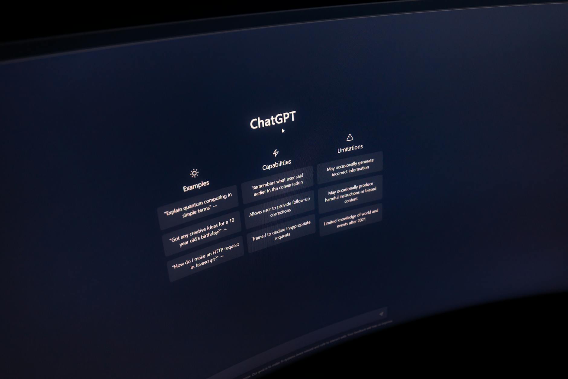
The Dark Art of Light Text: Tuning Typography for Dark Mode UIs
When dark mode rose from a developer-centric niche to a mainstream OS-level feature, designers rejoiced. We envisioned sleek, battery-saving, and cinematic interfaces. However, many quickly realized that designing a great dark mode UI is not as simple as swapping #FFF for #000 and calling it a day.
If you simply invert your color palette, you will quickly notice that your text looks blurry, overly bold, and physically painful to read. This is because typography behaves differently under different lighting conditions.
To build comfortable, accessible, and elegant dark mode UIs, you have to master the subtle physics of light text on dark backgrounds.
The Optical Illusion of Halation
To understand why typography fails when inverted, we have to look at how human eyes perceive light.
When you look at bright text on a dark background, the light pixels bleed into the surrounding dark pixels. This phenomenon is known as irradiation or halation.
Because of halation, white text on a black background physically appears bolder, brighter, and closer to the viewer than dark text on a white background—even if they share the exact same font family and weight. If left unadjusted, this causes letters to run together, filling in the counters (the enclosed spaces in letters like 'e', 'o', and 'a') and causing severe eye strain.
To combat this optical illusion, we must systematically tune our typography for dark environments.
1. Dial Back the Font Weight
Since halation artificially boosts the weight of light text, your first line of defense is to step down your font weights in dark mode.
If your light-theme body text uses a standard Regular (400) weight, its dark-theme counterpart should often be stepped down to a Light (300) weight, or at least a slightly lighter variant.
Variable fonts are an absolute game-changer here. Instead of jumping from 400 to 300, variable fonts allow you to shave off just enough weight to maintain optical consistency:
/* Light Mode Baseline */
body {
  font-family: 'Inter Variable', sans-serif;
  font-weight: 400;
  color: #1e293b;
  background-color: #ffffff;
}

/* Dark Mode Fine-Tuning */
@media (prefers-color-scheme: dark) {
  body {
    font-weight: 360; /* Slightly lighter to counteract halation */
    color: #f1f5f9;
    background-color: #0f172a;
  }
}

2. Give Letters Room to Breathe
Because light text bleeds outward, letters will feel much closer together in dark mode. To preserve readability and prevent characters from visually merging, you must increase your letter-spacing (also known as tracking).
A tiny adjustment goes a long way. For body text, a boost of 0.01em to 0.02em is usually enough to restore optimal legibility. For small captions or all-caps subheadings, you can push this even further.
.caption {
  font-size: 0.75rem;
  letter-spacing: 0.05em; /* Light mode */
}

@media (prefers-color-scheme: dark) {
  .caption {
    letter-spacing: 0.08em; /* Expanded for dark mode clarity */
  }
}
3. Avoid Pure White on Pure Black
High contrast is essential for accessibility, but maximum contrast is a recipe for eye strain.
Placing pure, unmitigated white (#FFFFFF) text onto a pure black (#000000) background produces an intense visual vibration. The contrast ratio is a staggering 21:1, which causes rapid pupil fatigue as the eye struggles to balance the extreme dark and light zones.
Instead, aim for a more organic balance:
- Soften your background: Use deep grays, dark slates, or rich navy blues (
#0B0F19,#121212) instead of pure black. - Mute your text: Use off-whites, cool grays, or light pastels (
#E2E8F0,#F1F5F9) instead of pure white.
Aim for a comfortable contrast ratio between 4.5:1 (the WCAG AA minimum for body text) and 7:1. Anything higher than 15:1 in dark mode tends to cause the dreaded "halo" effect.
Putting It All Together
Tuning typography for dark mode is a subtle art of compensations. To recap your checklist for dark mode typesetting:
- Reduce the weight: Drop your font-weight by 30 to 50 units (using variable fonts) or one standard weight step.
- Increase the spacing: Add a touch of positive
letter-spacingto counteract the optical bleed. - Soft contrast: Pair deep, rich dark grays with soft, warm off-whites.
By implementing these micro-adjustments, you will transform your dark mode UI from a harsh, eye-straining experience into a smooth, readable, and incredibly premium interface.
Photo by Matheus Bertelli on Pexels