Retro-Futurism: Why 90s System Fonts are Making a High-Performance Comeback
In the early days of the web, typography was a restricted frontier. Developers were limited to a handful of "web-safe" fonts pre-installed on Windows and Mac machines. If you didn’t use Arial, Times New Roman, or Courier, you were essentially shouting into a void. Then came the era of Web Fonts—Google Fonts, Adobe Fonts, and @font-face—which allowed us to polish the internet into a sleek, uniform, and often heavy experience.
But today, we are seeing a reversal. High-end design agencies, SaaS startups, and brutalist art projects are ditching custom WOFF2 files in favor of the raw, unpolished look of 90s system fonts. This isn't just a nostalgic trend; it’s a strategic move toward high performance and "Retro-Futurism."
The Performance Paradox: Speed is the New Luxury
In a landscape where a 100ms delay in page load can lead to a significant drop in conversion rates, every kilobyte matters. Custom web fonts are often the heaviest assets on a page after images. They cause "Flash of Invisible Text" (FOIT) or "Flash of Unstyled Text" (FOUT), which disrupts the user experience and negatively impacts Core Web Vitals, specifically Cumulative Layout Shift (CLS).
By utilizing system fonts—the ones already living on your user's hard drive—you eliminate the need for an HTTP request entirely.
Why System Fonts Win:
- Zero Latency: There is no download time. The text renders instantly.
- No Layout Shift: Since the font is already available, the browser doesn't have to re-calculate text containers once a custom font finally loads.
- Privacy: Not fetching fonts from third-party servers like Google means one less tracker and a more private browsing experience for your users.
The Aesthetic of Utility
Beyond performance, there is a cultural shift toward "Digital Brutalism." After a decade of ultra-rounded, friendly "startup fonts" (think geometric sans-serifs like Montserrat or Circular), the internet has begun to look a bit... identical.
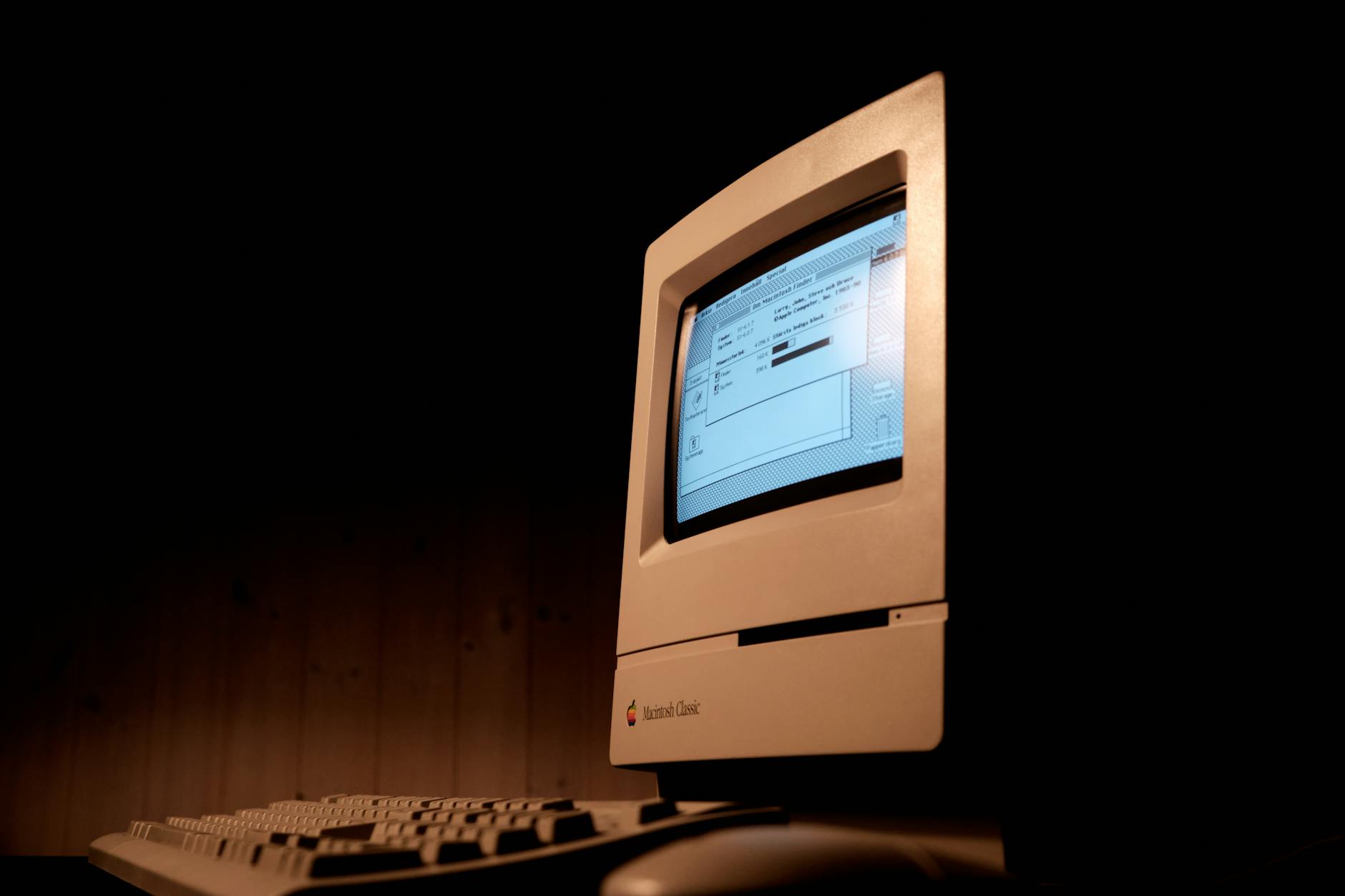
90s system fonts like MS Sans Serif, Tahoma, and Courier represent a time when the web was a tool rather than a shopping mall. This aesthetic, often called "Retro-Futurism," pairs the high-tech capabilities of modern CSS with the low-tech look of the early information age. It feels honest, transparent, and undeniably cool.
The Modern "Neo-System" Stack
Designers aren't just using Arial anymore. They are using sophisticated "system stacks" that adapt to the user's operating system while maintaining a cohesive retro vibe.
/* The 'System-UI' Stack for a Modern-Retro Feel */
.retro-label {
  font-family:
    "Fixedsys",
    "Courier New",
    "Terminal",
    monospace;
  letter-spacing: -0.02em;
}

.interface-text {
  font-family:
    -apple-system,
    BlinkMacSystemFont,
    "Segoe UI",
    Roboto,
    Helvetica,
    Arial,
    sans-serif,
    "Apple Color Emoji";
}

Designing with Limitations
Embracing 90s typography requires a different design philosophy. You can't rely on the inherent beauty of a boutique typeface to do the heavy lifting. Instead, you focus on:
- Information Density: Using smaller font sizes and tighter grids to mimic old software interfaces.
- Contrast: Utilizing bold primary colors and high-contrast borders (the "Win95" look).
- Micro-Interactions: Pairing system fonts with modern CSS animations to create a "smart-lo-fi" experience.
Sustainability in Design
There is also an environmental argument to be made. While a few font files might seem negligible, when scaled across millions of page views, the energy required to transmit and render custom typography adds up. By using what is already there, we reduce the carbon footprint of our digital products.
Retro-futurism proves that we don't need to reinvent the wheel to create something visually striking. Sometimes, the most "futuristic" thing we can do is look back at the systems that worked, strip away the bloat, and let the raw utility of the 90s drive the high-performance web of tomorrow.