Anarchy in the Elements: Why Brutalist Typography is Taking Over Modern Web Design
For nearly a decade, modern web design has been governed by a polite, sterile consensus. Driven by the gospel of user experience (UX) optimization, websites have evolved into highly polished, predictable grids. We see the same clean sans-serifs, the same generous white space, and the same friendly, rounded buttons everywhere.
But a quiet rebellion has been brewing. Designers are increasingly rejecting this homogenized aesthetic, opting instead for visual friction, raw structure, and deliberate chaos. At the heart of this movement is Brutalist Typography—an aesthetic of typographic anarchy that demands attention, defies conventions, and is rapidly redefining the modern web.
The Roots of Digital Brutalism
To understand brutalist typography, we must look to architectural history. The term originates from béton brut (raw concrete), used by pioneer modernist Le Corbusier to describe his unfinished building materials. Architectural Brutalism was characterized by massive, monolithic concrete structures that wore their structural elements proudly on the outside. There was no paint, no plaster, no decorative facades—only raw honesty.
In digital design, Brutalism manifests as a reaction against "over-designed" templates. Brutalist typography strips away the decorative gradients, subtle shadows, and polite hierarchies of Web 2.0. Instead, it treats text as a physical material: heavy, unyielding, and structurally dominant.
What Defines Brutalist Typography?
Brutalist typography is not just "ugly" design; it is a calculated deconstruction of traditional typesetting rules. Here are its defining characteristics:
1. Monumental Scale
In brutalist web design, text is rarely just content—it is the layout itself. Headings are pushed to extreme sizes, sometimes spilling off the edges of the viewport or wrapping awkwardly across lines.
2. Monospaced and System Fonts
Instead of elegant, expensive custom typefaces, Brutalism embraces "default" aesthetics. Courier, Times New Roman, Arial, and heavy, system-default sans-serifs (like Impact) are elevated to high art. They represent structural honesty, signaling that the website is a functional document rather than a curated advertising campaign.
3. Disregarded Grids and Overlaps
While traditional design treats elements as polite neighbors, brutalist design lets them collide. Text overlaps with images, headings crash into paragraphs, and borders are rendered in harsh, thick, 1px or 2px solid black lines.
Coding the Chaos: A Practical CSS Example
Creating a brutalist typographic layout relies heavily on raw CSS layout modules like Grid and Flexbox, paired with aggressive typography properties. Here is a simple CSS recipe to create an unapologetically brutalist hero section:
<header class="brutalist-hero">
  <h1 class="hero-title">ANARCHY<br><span>IN THE WEB</span></h1>
  <p class="hero-meta">SYSTEM_VERSION_1.0.4 // NO_REGRETS</p>
</header>
.brutalist-hero {
  background-color: #f0f0f0;
  border: 4px solid #000;
  padding: 2rem;
  font-family: "Courier New", Courier, monospace;
  color: #000;
  min-height: 80vh;
  display: flex;
  flex-direction: column;
  justify-content: space-between;
}

.hero-title {
  font-family: 'Arial Black', Impact, sans-serif;
  font-size: clamp(3rem, 10vw, 12rem);
  line-height: 0.85;
  text-transform: uppercase;
  letter-spacing: -0.05em;
  margin: 0;
  word-break: break-all;
}

.hero-title span {
  -webkit-text-stroke: 2px #000;
  color: transparent;
}

.hero-meta {
  font-size: 1.2rem;
  font-weight: bold;
  background-color: #ff5500;
  color: #fff;
  padding: 0.5rem 1rem;
  align-self: flex-start;
  margin-top: 2rem;
  border: 2px solid #000;
}

Why This Works:
clamp()for Scaling: The title scales fluidly based on the viewport width, ensuring it remains massive on screens of all sizes.- Negative Letter-Spacing: Condensing the tracking (
-0.05em) forces the letters to crowd together, creating visual tension. - Text Stroke: Making the fill transparent and adding a text stroke breaks traditional readability rules, forcing the user to decode the shape of the words.
- High Contrast and Sharp Borders: Thick black borders combined with solid, bright colors block out the space aggressively.
Balancing Rebellion with Usability
Can an anarchic website still be accessible? Yes. In fact, true Brutalism is highly compatible with web accessibility and performance guidelines. Because it avoids heavy background images, complex Javascript animations, and massive custom web fonts, brutalist websites are incredibly fast and lightweight.
To maintain accessibility while embracing brutalism:
- Keep High Contrast ratios: Ensure your text colors pass WCAG AA standards against their raw background colors.
- Preserve Semantic HTML: You can style a document to look chaotic, but keep the underlying structure clean. Screen readers should still encounter logical
<h1>,<p>, and<nav>tags. - Respect User Preferences: If you are using brutalist animation or blinking elements, use media queries like
@media (prefers-reduced-motion)to disable them for users who require a calmer browsing experience.
Conclusion
Brutalist typography is more than just a passing visual trend; it is a cultural response to a web that has grown too comfortable and too predictable. By breaking the grid, scaling fonts to gargantuan sizes, and stripping back decorative fluff, brutalist web designers are reminding us that the browser is an open canvas for creative expression.
In a sea of identical templates, a little typographic anarchy might be exactly what your next project needs to stand out.
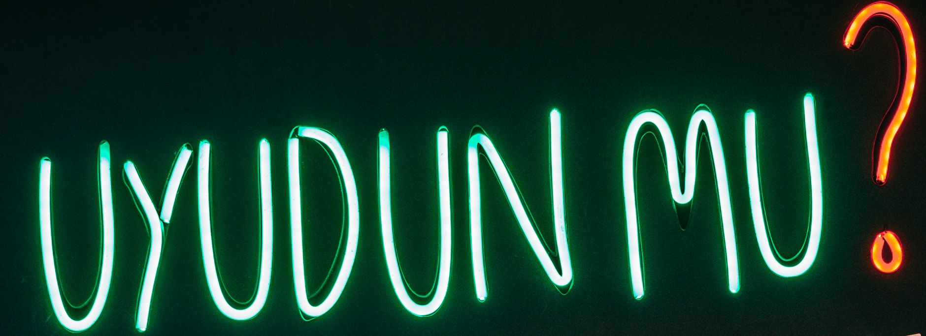
Photo by Meruyert Gonullu on Pexels